Monday 31 December 2012

Darling Diva Apple Crisp

Time has flown over the Christmas break. It is not too long before I will need to go back to work. Until then I will continue to enjoy the antics of Mr R and Miss L.

Today I bring to you Apple Crisp from Darling Diva Polish. It is a scented polish and it slakes my desire for Femme Fatale Stolen Reindeer except for one important point. I removed the polish soon after as the scent was not my cup of tea. Although I am sure I picked up a vanilla smell, I am sure it also smelled like cinnamon as well. No, they are not bad smells but they were definitely too strong!


For my base colour I used two coats of Colour by T.B.N Raisin. This brand of polish has a strong smell but it has an interesting array of colours available for a cheap price. Raisin is a great brown and it helps to flesh out the browns in my collection.

.

Look at the mix of colours in this polish. I love the addition of the different red glitters with the holographic and iridescent. My version of the polish does not appear to have as much green glitter as in the pictures from Darling Diva's listing. I do not mind one little bit as this is still visually appealing. I just wish I could stand the smell of this.

Unlike most Darling Diva Polishes, I did not need to thin this. Darling Diva does not cut the suspension base so you can add thinner to make the consistency you would like. Most of the time I find I need to add thinner because the base is too thick to apply.

Monday 24 December 2012

O Tannenbaum! O Christmas Tree!

I am not having much success with using PVA as a base coat ever since I had a manicure done. I suspect that the buffing they did on my nails made the surface so smooth that the glue does not have the type of surface it needs to adhere well. Every time I have worn a manicure since the manicure I have used PVA and the polish just pops off.

For this Christmas I had planned to do a few different manicures and life got in the way. We have come to the holidays now and I get to post my Christmas Tree. Someone had mentioned in a post on a blog that Darling Diva's Mitochondrial Eve looked like a Christmas Tree complete with ornaments. There and then I decided that I would get Mitochondrial Eve and I would do a Christmas Tree manicure.


But... I left off buying Mitochondrial Eve. I was trying to be financially wise and then when I was able to buy, the polish was not listed any longer. Oh no! I messed Darling Diva and asked if it was possible to get Mitochondrial Eve. Joy of Joys an affirmative response was received.

The base colour for this manicure is Ozotic 502 that reminds me of Sally Hansen's Nail Prisms Golden Cinnbar when worn. This polish is lovely by itself and I did not take pictures to capture the different colour shifts.


To create the Christmas Tree I simply used tape and applied two dabbling coats onto the nail. Simple, done. If I had longer nails I would have added a star at the top but I do not believe I had the space to make it look good.

You only get three fingers in this picture as I hurt my poor index finger. You can also tell that I did not clean up afterwards with the top coat. Not too long after these pictures were taken when POP! off they came.

Tuesday 11 December 2012

Countdown to Christmas

It is hard to believe that it is only two weeks until Christmas. We spend so long with the build up in the shops and then the day itself is suddenly here.


We have two countdown calendars in our house. One for Mr R and one for Miss L. Yesterday I took pictures of Darling Diva's A Christmas Story with Miss L's. I did intend on trying to get the pictures up last night but I am sure that somewhere it will still be 15 days to go when I post.

Most of the pictures I have seen posted of A Christmas Story have shown the polish as a green and red microglitter mix. It sparkles freely but there is a hidden delight. Yes, there is a holographic element. Taking the pictures in the sun showed the rainbow of colour.


For the base colour I used Sephora by OPI Mr Right Now. I feel this was the perfect red after applying two coats to match the red of the glitter in the bottle. Only one coat of A Christmas story was required and I applied two coats of Seche Vite as the first coat was not smooth and slick.

Saturday 1 December 2012

Dead Ringer for Fantasy Fire. Shift Happens eh?

It seems a long time ago when I bought Ringer from Darling Diva Polish on etsy. Ringer is much more affordable and in a larger bottle than Fantasy Fire. That is even when you consider shipping it to Australia. I thought I could go the whole hog and get a mini bottle and a large bottle for that shifting goodness.

Then when my bottles arrived there had been another arrival in Australia. Yes, Max Factor had released Fantasy Fire here. Of course I had to secure my own bottle. Ok, maybe I had to get two but I did share!


Looking at Ringer and Fantasy Fire in their bottles they seem to have exactly the same shift at the same time. Sometimes when I look really hard I wonder if the particles in Ringer may be a little larger than Fantasy Fire. The base colour appears similar although Ringer is more sheer in appearance. Maybe there are more particles in Fantasy Fire but using the polish I did not notice any difference on the nail.


For my base colour I tried to choose a similar colour to the base colour of Fantasy Fire. I wanted a simple creme polish but I found that I did not really have one even though I love purple so much. There seems to be an added factor to most of my polishes. I used Satin Seasonal Nail Enamel 1. Two coats were applied but I feel I should have added a third. This is because I think it would have added more depth to the colour and made the polish pop more.


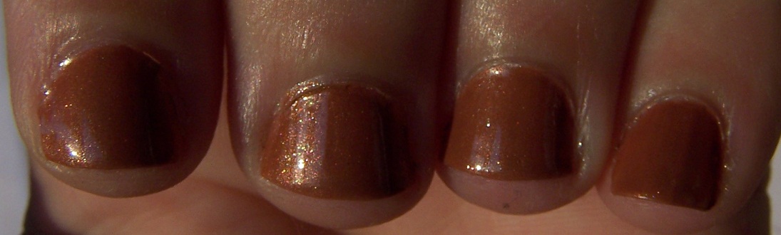
I had exceptional trouble trying to capture Fantasy Fire on camera today. It is swelteringly hot and I wonder if somehow the camera is affected. That seems silly but I could not stop taking pictures and getting good shots the last time I photographed Fantasy Fire for Spring. Fantasy Fire was applied to my index and ring fingers and Ringer graces my middle and little fingers. For an extra comparison but not really captured, I used Girly Bits Shift Happens on my thumb.

It may seem in the above photo that the middle finger may have less pigment but you can not tell any difference in reality. The difference in the picture may be the angle or the like.


Shift Happens seems to change more readily from red to yellow and for longer than Fantasy Fire and Ringer. Essentially, there is not much difference in the Ringer from the handmade batch I had to Fantasy Fire. I would call them dupes. Shift Happens is a great alternative and could be applied to a greater array of colours as it does not have the purple coloured based of Fantasy Fire and Ringer.


I was thrilled when I was able to capture this blue shift that came after the green shift. This seems to be the greatest extreme of the colour shift in these polishes.

All three polishes are beautiful and I feel fortunate in owning all three. Shift Happens ended up being the most difficult for me to buy but it eventually came my way from Llarowe. Personally, if you just want Fantasy Fire and can't buy it at a local shop, I would buy Ringer from Darling Diva. I would hurry because it seems as though this pigment is going to he hard to get if at all. For versatility, I would get Shift Happens. I have one more way I want to try Shift Happens as the colour shift changes nature depending on the base colour.

There you go Melissa. I posted as promised. :)

Wednesday 28 November 2012

Starbucks and Zebration for my 100th post!

When I looked at plate MJ VI I thought that the lady image looked familiar. At first I thought it may have been a logo for Godiva until I went into the kitchen and noticed that the logo on my Starbucks cup was the same. In my defence, I have probably had something from Starbucks less than the number of fingers on one hand. There is not an outlet locally either.


To start I stamped the Starbucks Mermaid onto the more rigid plastic of a sandwich bag using Konad Black. Ulta3 Lily White was brushed over the top. I had to try this a couple of times because I did not wait long enough for the black to dry the first time. Applying the white smeared the black to make a round grey mess. I left that to dry for another day's manicure. This is a method that I bookmarked from Polished Peripherals.

The day finally came to do my manicure and I had to select my green. None of the greens in my collection matched that of my cup. They were either too pale or too dark. Ulta3 Frog Prince is the closest I could come to the right colour. Two coats of Frog Prince went down over a PVA glue base and another layer of PVA was added to the top on my thumb to stick my mermaid onto. I allowed all of the layers to dry before adding Seche Vite.


On my index and little fingers I used Peita's Polish Zebration to carry through the black and white theme from my Starbucks Mermaid. Konad White was used for the two images on my middle and ring fingers. I thought I would add some beverages onto those fingers. The take away cup with straw was too large for my trimmed down shabby nubbins but I still think it looks good. It came from plate MJ VIII. For the coffee cup I used only the cup part of the "Coffee Addict" image. You can find it on the Fun 2 plate.

Monday 26 November 2012

MUD Blue Moon - What is MUD polish like?

MUD - Make Up Design nail polish is a new release at Woolworths Supermarkets. Two colours stowed away into my trolley when I did the grocery shopping. Blue Moon is the first one I have tried.

The packaging makes a few claims about this polish. They claim it has high shine and does not streak. I think it fails on both accounts because the only way this polish became shiny was with the addition of a top coat. Application was streaky and required three coats to achieve the opacity in these pictures. Blue Moon's packaging claims that you only need two coats under their Tips and Tricks.


Blue Moon IS a pretty polish. If you ignore the claims on the packaging and consider it as a budget concious polish, then it is not too bad. It is a lovely shade of blue that looks good within three coats of polish. That is not overly excessive although I prefer to use two coats at the most.

To spice up the manicure I added Humble Bee. I want to do a proper manicure with effort for this heavily desired and hard to get polish. I think it pops nicely against the blue. It would have been great to get more pictures but my PVA glue based polished started popping off before I could get more pictures in the afternoon after work. I just don't have the heart to redo the manicure and it looks like overcast, miserable weather has set in.

Sunday 25 November 2012

Christmas Pudding

Ever since I have seen Christmas Pudding manicure designs, I have waited for Christmas to arrive so that I can finally do one. With the work Christmas Party, I thought it was a brilliant opportunity to be able to do a Christmas Pudding design earlier.


For the cake part of the pudding I started with OPI Who Comes Up With These Names? Two coats later I left it overnight. In the morning I applied L.A. Girl Uninhibited to represent the fruit in the pudding. It would be great if I had a polish with the small black glitter for the sultanas and raisins and the larger glitter was red for glace cherries.


Excuse the very early morning light for the picture. I was up and making cupcakes for the party that night at 4:30 in the morning. The glitter dried quickly and that allowed me to paint the sauce on using Ulta3 Lily White with a nail art brush. I always envisaged having this manicure with holly on it but I didn't have anything I could use and my nails are too small for any stamping images.


I managed to get the cakes cooked, frosted and decorated before I left for work that morning. A load of washing was done for the children with their school uniforms for the day. Phew! The party went well and we scored plenty of things. I won a bottle of wine with my raffle ticket and another two bottles through auctions with play money. Mr R spent the rest of my money and was very proud of himself. He won a hamper stuffed with sweet and savoury food. Only about half of the items can be seen here.


Friday 23 November 2012

News Flash: MUD Make Up Design at Woolworths

Do you remember how Woolworths had the Ulta3 bins in the supermarket a few months ago? Now they seem to be all gone with a few lonely baskets of polish waiting to be reduced further. In this week's catalogue for Woolworths they introduce a new cosmetics range called MUD - Make Up Design. They seem to be a very popular release because there was not much available when I did my grocery shopping last night and slipped a couple of items in.


As you can see (excuse the impatient night picture with flash), the products are individually packaged so that you do not need to worry about whether someone has opened the bottle of polish and played with it before you buy it. In the nail range, they have nail polish and nail stickers. It is a small range of colour but at least it has a daring range of colours. They do not stick with traditional pinks and reds.


Look at the nail stickers! Admittedly these were the most interesting and unique of what was available. There were only four designs available: a lace design, a pink glitter, a red base colour with white polka dots and this raised crystal star design. All of them can be easily replicated with stamping or a dotting tool apart from the stars. I have never tried nail strips before but I thought I would try these at $5.


MUD is another cosmetic range from the Heat Group. They also make Ulta3 and NYC. Woolworths are selling the 13ml polish for $3.

Wednesday 21 November 2012

Nail Fail - Glitter and Gradient Stamping

Today I bring to you a nail fail. It does not look overly terrible except for the fact that I did not clean up at all in the end because I knew it was not working out. The manicure does not work like it is supposed to do.

Early in the days of this blog I posted a haul post. This is one of my most successful posts even though it only consists of pictures of nail polish bottles I bought... Two of these polishes are Nicole by OPI polishes called Virtuous Violet and One Less Lonely Glitter. This is the first time I have ever used them.


Virtuous Violet is a nice colour. In the bottle the shimmer seems almost duochromatic. To get enough coverage on your nail you need four coats. I used three here because I knew the glitter would work fine with only three coats.


I seems it would take too many coats to make One Less Lonely Glitter opaque. On other blogs I saw that most people seem to still have some nail visible at three coats. It has pretty mauve small and microglitter in a clear base. The brush seemed rather clunky but I applied the polish without problems.

Onto the fail part of the manicure. Miss L decided she wanted both Kleancolor Metallic Pink and Metallic Aqua "side by side". I sponged a gradient on for her and she was mightily pleased. Her nails are very small and the ridges around the cuticle and the sides of her fingernails are deep. It makes it difficult to get the sponge into the area to dab the polish on.


I decided that these two colours would go well with the purples. Since I already did a sponged gradient, I thought I would stamp one onto my fingernails. The plate I used was an MJ plate but you can not see the full nail heart design. Part of the problem is that I used the double sided stamper from Lightinthebox.com. It was TERRIBLE as the silicone part of the stamper is much harder than the Konad one I adore. I switched over to the Konad double stamper after doing my thumb and index finger.

This one will come off soon. Thank goodness I used PVA glue as a base.

Monday 19 November 2012

Movember and International Men's Day

Today is International Men's Day and about two thirds of the way through for those growing their (hopefully) spectacular moustaches for Movember. I am proud to admit that Movember was started in Australia and has grown from there. It seems we have a lot to do to catch up to those Canadians but at least we are giving our men some support for men's issues.

Visit the Australian Movember website has lots of information, merchandise and ways to connect to other Mo Bros. Most importantly you can donate to the foundation for the funds to be used for men's health initiatives such as prostate cancer and mental health.


The theme for International Men's Day for 2012 is health to tie this post in nicely with the aims of Movember. Helping men to be aware of their own bodies and minds will help them to live longer and happier lives. That is something to want for every special man and man-to-be in our lives.

Don't Feed the Hand Models from Sephora by OPI tends to be my go to nude base colour. I have used it here in two coats to represent skin. I would have done different skin colours but I did not have the polishes to represent that.


On the new MJ VIII image plate there is a full nail image of different moustache styles. These are perfect for Movember. Different shades of Kleancolor Metallics were used to represent different whisker colours for the moustaches. We have Metallic Black for black whiskers, Metallic Mango for the ginger whiskers, Metallic Yellow for the blond whiskers and Coffee Addict for the brown whiskers.

Saturday 17 November 2012

Living in Sin with Fairy Bread

I managed to get my hands on Australis Fairy Bread and then it languished in a box. The good news is that I took it out and put it over another untried, Chi Chi Living in Sin. Fairy Bread is a limited edition polish and I found Living in Sin on the bargain bin at Target. Both have "silly" names that attract me, especially Living in Sin.


Chi Chi describe Living in Sin as "violet with a hint of black" but I find it more purplish blue. A blackened purplish blue if you want. I was worried about the colour because I did not know how frosty it would be. It applied well but I found that the colour is completely different with and without top coat. The name of the line is failing me right now, but I know the clear topcoat colour changing properties are a feature of a collection. In this case, the colour is paler, more silvery in appearance.


After applying one coat of Living in Sin, I brushed and dabbed on a coat of Fairy Bread. I found that Fairy Bread seemed to change the colour to appear more navy.


The curling in the glitters can be seen easily in the below picture. I think that they look good in this case but I have not been a fan of curves in my glitter so far.


In this instance I think Living in Sin with Fairy Bread is a good idea. ;)

Friday 16 November 2012

Iridescent Eye visiting the Celtic Moon

I decided that I would do something with my right hand. There was a blank canvas of Orly Matte Vinyl and it was begging for me to decorate it.

Another design from MJ VIII was used with Jessica Iridescent Eye as the stamping polish. I had heard how well China Glaze's Bohemian collection stamped over black and I thought that this polish would as well. The full nail image I used appears to be a variation of a Celtic Knot treatment.


I would have left my nails with just the Celtic Knot design over the matte black polish but I had a slight mishap. All of my nails stamped well except for the little finger. Since I did not have a top coat on, I could not remove my failure and re-stamp. I was also reluctant to remove all of the nail polish and start again. Putting another layer of Matte Vinyl and then stamping over that would have made my polish too thick on my nail.

Over to one side of the coffee table I still had some paper reinforcer stickers. I still have not tested the design I was going to do with them when I pulled them out of the box! The perfect solution was to use the stickers as guides to make half moons. When I painted the rest of the nail with Iridescent Eye, my little mistake where the polish did not go would be covered.


These pictures were difficult to take as I had little light to work with the first time I tried. When I had light outside available the manicure had lots of wear as I did not use top coat to seal it all in. I wanted to preserve the matte. The other reason why it was difficult to take picture is because of my camera. It is hard to hold the camera in my left hand, keep it steady AND push the button to take the picture.

Wednesday 14 November 2012

Happy Birthday November! Citrines and Chrysanthemums

Some of the symbols of November are citrine for the birthstone and chrysanthemums for the flower. I have used both of these elements for this birthday manicure for November.

I started with Kleancolor Metallic Yellow for the base colour. This was the best shade I had with that yellow colour to match citrines. Granted citrines come in a range of colour but I wanted a rich yellow that had that gem like quality and shine. That is a little hard since all I have are either golds or creme yellows that were not quite right. I was surprised by rainbow flashes of shimmer in Metallic Yellow when the light hit it. I never expected that as I thought it would be a simple gold.


In Australia, chrysanthemums are usually sold in May for Mother's Day. I have never liked chrysanthemums because the cut flower smells terrible. Pyrethrum keeps me away as well as the insects. Thankfully, Mr R and Miss L have never bought me any, yet.

Nevertheless, I find the stylised chrysanthemum image from Bundle Monster BM-313 pretty. This was stamped in Konad Black. I was going to use Kleancolor Metallic Black but I knew the Konad was the best for that dark, black and crisp image. If this had been an all over image with a lot of clean up required, I would have chosen something else as Konad Black is horrendous to clean up.


The placement may seem all over the place but I was trying to do the same design differently to add interest. My right hand that I did afterwards has a more even placement and it looks good all lined up together. Unfortunately my left hand refuses to assist in taking a photograph to show you.

Good Morning Sun. Are you ready to be eclipsed?

Mr R is very excited about the eclipse this morning. He has set his alarm so that he can be up in time to view it. Unfortunately we do not have viewing glasses but we looked up pinhole viewing techniques. Both of the children were warned about the dangers of viewing the sun directly because even the smallest slither of the sun can cook your eye.

So, sun are you ready to be eclipsed by that itty, bitty moon? I hope to try to get some kind of decent picture but I am not certain I will. This is an opportunity we won't have here until 2028.

Pre-eclipse
I took pictures through the (currently ongoing as I update this) event. The eclipse could not be captured by me on camera at the maximum eclipse here of around 80% coverage of the sun. About an hour before the maximum eclipse I did take a picture where you can see the moon on approach to the left.

Moon on left on approach to eclipse
It was very dramatic when the light suddenly dimmed due to the passage of the moon. You could still see plenty of sunlight but it was as though it was earlier in the morning or the sun had been obscured by cloud in shadowing. We did manage to view the partial eclipse using pinhole viewing techniques.  The resulting shadow becomes a crescent rather than a round shape.

Pinhole viewing
Time to get myself ready for I will be late for work. I managed to get the children ready before the "action" but not myself!

Sunday 11 November 2012

Lest We Forget - Remembrance Day 2012


"Those heroes that shed their blood and lost their lives…

You are now living in the soil of a friendly country. Therefore rest in peace. There is no difference between the Johnnies and the Mehmets to us where they lie side by side here in this country of ours…

You, the mothers, who sent their sons from faraway countries wipe away your tears; your sons are now lying in our bosom and are in peace, after having lost their lives on this land they have become our sons as well."

Ataturk, 1934 - Gallipoli Memorial at ANZAC Cove


My base colour is two coats of essence Viva La Green. My bottle was very thick and tacky. As this is the first time I used it, I think people had opened the bottle in the store before I bought it.


Poppies are an enduring symbol of Remembrance Day and I chose to use these for my manicure. Both of the images that I believe to be poppies are from Bundle Monster image plates. The image with the two poppies comes from BM09 and the single poppy is from BM06. Konad special polishes in red and green were used for the stamping.


Gloomy Sunday - Black on Matte

It is a dismal, gloomy day. A Gloomy Sunday. I first encountered "Gloomy Sunday" in the movie "Schindler's List". The song has a reputation for being associated with suicide. I do not know if the song deserves the reputation or not but I definitely feel more despondent in rainy weather.


I applied two coats of Orly Matte Vinyl and this gave me a black chalkboard like finish. In the picture above you can see some of the rain drops that fell on my nails as I took these pictures. There is some smearing on the lower left from a drop on the lens of the camera. I braved the rain as I have been unable to take decent pictures inside my house.


The look of shiny stamping over matte has been something I have wanted to try for some time. So I used Konad Black and stamped a design from MJ VIII. I like how simple and subtle the design is. It's something different to have the sheen of the special polish picking out the features of the design as a counterpoint to the dullness of the matte.

I thought I had cleaned up well but black is not your friend in the clean up stakes. This is especially true with Konad Black. I used cotton buds AND a brush to get into the crevices. Ooops. I can't seem to get all of that polish out.

Friday 9 November 2012

No H8 Mate.

As an activity, polishing your nails and obsessing over them appears to be a very vain thing. It is something you spend a lot of time on and the thought of damaging a nail can make some women devastated. Let's face it, nail polishing can attract the shallow and the mean, people who place so much importance on how things appear. It took me a long time before I had enough confidence to decorate my nails even though they are not perfect.

I started seeing No H8 posts in my feed when it was no longer the 8th November here. I wanted to add my support to the fact that words across a computer screen can hurt. Text on the screen can not convey the emotion and body language of face to face interactions. This removes our ability to receive and interpret cues for what is being conveyed to us. This barrier also amplifies the distance and impersonality of the other people using the internet.

Most of the time the best course of action is to "walk" away. You do not know if the other person is being a troll and seeking attention or if they genuinely do not realise that they came across negatively.


I used matte polish for the fast drying factor. I would like to take pictures in sunlight to see if the manicure looks better. The base colour is Orly Purple Pleather with two dots of Orly Purple Velvet. Over the top of these two dots and an extra one is Max Factor Fantasy Fire.


Bullying is not funny. It is not cool. It is not right. And more importantly, it is not okay. Most of us are, thankfully, residents of countries that support tolerance and many of our families have settled in these places simply for that reason. Generations later, it is our responsibility to perpetuate that message of tolerance across our new social platforms, including the internet. 

As members of the nail polish blogging community, we all share a love of beauty, color, and lacquer. Other than that, we are remarkably different: from our race to our religion to our hair color...even to our polish application techniques. To marginalize anyone because of those differences is completely unacceptable and today I take a stand against that. I refuse to allow other people's view of "normal" dictate how I behave, believe, and blog. 

In solidarity with a multitude of bloggers linked below, my purple manicure represents my proud commitment to the No H8 movement. Today, November 8, I dedicate my post to ending bullying of any kind and to encouraging diversity and imperfection among our colourful community.

Wednesday 7 November 2012

Green Moon and winner of the 2012 Melbourne Cup

I am not that interested in the Melbourne Cup except as an excuse or inspiration for nail art. Cup Day was about frocking up at w ork. When I heard that the winner of the cup was Green Moon, I instantly thought of green moon fingernails.

A moon manicure is something I have never tried. Luckily I did get some paper reinforcement stickers in preparation for such a day. I do think that a moon style is better suited for longer nails than mine but I could not resist with a tribute to this Irish horse.


In my quest for fast polish drying and mixing things up a little, I used Orly Viridian Vinyl as my base colour. It is a green matte polish although the finish tends to be more satin. I let that dry overnight while I did a Google search to find out what the colours were of the jockey's silks.

This morning I woke up and got my paper reinforcers ready with Orly Blue Suede. The satin matte polish to bring the look together while drying fast. Brett Prebble's silks were navy blue with white stripes as armbands. I don't own a white matte (*gasp*) and I did not think that white would go over the navy well.


Green Moon turned out better than I expected for I worried about my placement of the moons. Also, I would have liked to have been able to put a white stripe on for the other part of the jockey's silks but opacity and bleeding concerned me. There could be lots of improvement but this will do fine.

Tuesday 6 November 2012

The race that stops a nation - Melbourne Cup.

Today was the day of the big race. When I started work at my new location I was told that it was a must to get all dressed up for Melbourne Cup Day. It is tradition to wear clothing like you were going to the races with fascinators. They also tend to go to a luncheon.

I did frock up in a black halter neck dress with red roses. I would have liked to match my dress to my nails but I did not have time to polish my nails. The time factor was what made me choose Avon Red Velvet for the matte polish dries super fast factor. I had hoped to get some stamping in before I stuck things to my nails but I did not have time for that either.


For decoration I went with the black butterflies and the black and white roses. There were some fimo slice butterflies in red that I decided to put on too. Unfortunately my skill in handling the nail glue was dismal. I got it all over my fingers. There is a spot of it on the floor. Yes, I even spilled a large part of the bottle onto my coffee table. Lint will be seen in the pictures too as I tried to get some of the glue off with acetone. Not my luckiest of days.


I also did not win anything in the work sweeps. :P I did win a compliment from a male customer when I gave him his change. He reassured me that I did not stab him with my butterflies.

If I had done my nails after the race I could have done them in honour of the winning horse, Green Moon.

Monday 5 November 2012

I Love Conversation Hearts

Recently I received some MJ plates from the creator of the Fun plates. I was pleased with how quickly they arrived from the Phillipines to my end of the world. The only thing I was uncomfortable about in ordering these was wondering what the postage fees would be like.


The Conversation Heart lollies image is from MJ VI. I had to rummage around in boxes for the tools to do this since I have not unpacked my nail polish properly yet. Hopefully that will happen soon. For ease, the stamping polish was Konad's special polish in mauve. I think the image stamped as well as any other image I have from Konad or Bundle Monster plates.


The base polish is Pretty Serious Emma Louise that I posted about recently.

I found out about this newest release of image plates from Spellbinding Nails. They are a great collection of plates and I will have to bring more in coming posts. You can order your own from My Online Shop. For the four large image plates I was changed 650 Phillipine Pesos which exchanges to around A$15.